Our City Chic atmosphere is ideal for contrasting your interior! Is the basis of your interior complete, but could it be a little more exciting? Or are you still in the early stages of putting together your interior? Then this is a must read, because applying contrast in your interior provides a mega atmosphere upgrade!

Add contrast to your interior with the City Chic style
There are several ways to create contrast in your interior. Think of colors, shapes and materials. You achieve the best result by applying contrasts of all three of these variants. The City Chic atmosphere is perfect for this! When you're designing your interior, a mood board ensures that you can capture these contrasts at a glance, as a clearly organized whole. This way you can also easily remove and add elements to see which contrasts suit your taste and interior best.
Color contrast
Color is one of the easiest ways to add contrast to your interior. Frequently used contrasts are cool-warm and light-dark. With a few simple adjustments you can add colors that contrast with your basic interior colors. For instance by painting a wall, putting down plants or adding home accessories such as colored candles, vases and decorative pillows.
Cool vs Warm
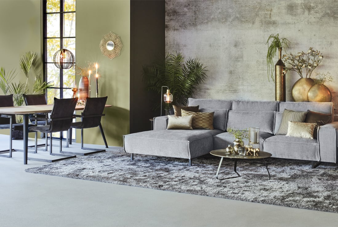
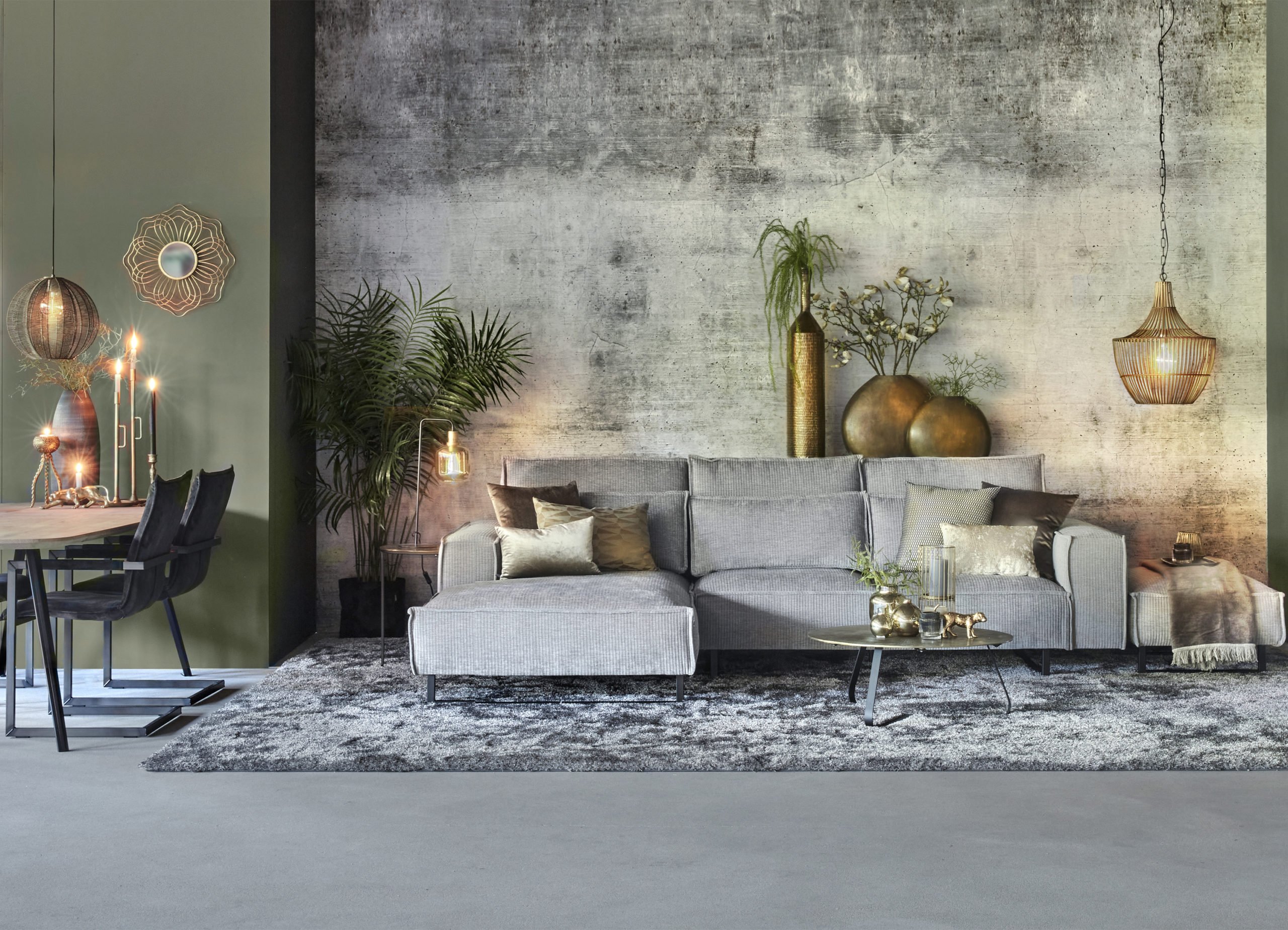
Both corner sofa Diane upholstered with fabric Bodega and color Steel and the carpet Landro in color mix 22 are a light gray, hence cool color wise. The warm golden color accents of the home accessories create a nice cool-warm contrast. The decorative pillows and warm-toned plaid contrast beautifully with the sofa, just like the golden vases behind it.
Light vs Dark
In this interior, the light-dark contrast can be seen in the dining area. Here, a light table and dark dining room chairshave been chosen. The dark colors are emphasized by the black window frames.
Shape contrast
Creating contrast with shapes often works best with large elements. You want the different shapes you're using to actually have an effect. So do this especially with the furniture in your interior and emphasize the contrast with home accessories in different shapes. Shape contrasts to consider are round-straight and high-low.
Round vs Straight
Straight corner sofa Diane and straight carpet Landro immediately stand out in this interior. To create the round-straight contrast it is therefore important to also place round or organic furniture. In this set, the round coffee table, the semi-circular side table and the organic dining table provide a contrast to the straight furniture. To emphasize these round shapes, you also see round lamps, round vases and a round mirror.

High vs Low
The high-low contrast is perfect to apply to the table styling. On the dining table you see a combination of high and low candlesticks and on the side table there are high and low vases. A tip to easily create height is the use of plants and branches.
Material contrast
Contrasting material is probably one of the more difficult variants. As materials are very decisive for your interior, combining them can be quite a challenge for some. So don't make it too hard on yourself and choose, for example, the contrasts matte-gloss and soft-hard.
Matte vs gloss
In this City Chic interior, the matte-gloss contrast can't be left out. For this contrast makes for a very chic effect. The matt base of the floor and walls contrast with the large glossy carpet. The matte dining table also forms a contrast to the velvet chairs and brass table decoration.
Soft vs Hard
Soft materials often make an interior chic and hard materials provide a tough look. By combining them your interior gets the best of both worlds. The wooden dining table in combination with the chairs upholstered with velvet, are an attractive whole. This contrast is also created by the soft fluffy carpet on the hard floor.Like that, ready to add contrast to your interior!


